I am a big fan of SAS's JMP software. It is the first statistical program I learned and I really like how the emphasize visualization. In their most recent update, JMP 9 now has the ability to create maps. I have been itching to test this out for a little while and I came across a map on the internet that I thought would be a good test. It is the percentage of the population of each state that has a passport.

Luckily, the website has the source data so I "jumped" right in. It was really easy.
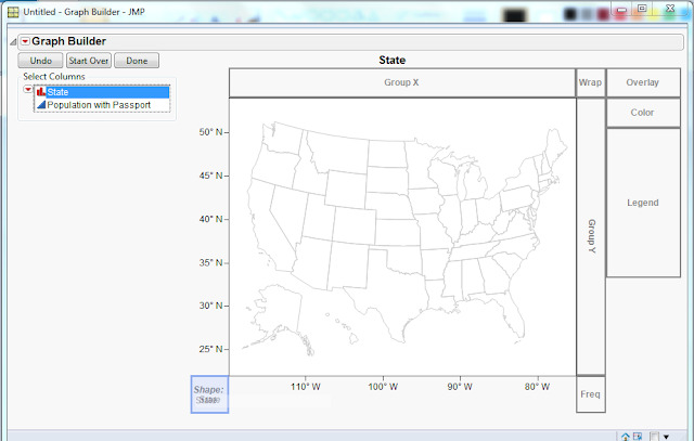 You can see the outline of the USA in the map. JMP recognizes that the state field is filled with US state names, so it knows to open the shapefile of the US states.
4. Drag the Population with Passport field onto the main map. You can also drag it into the Color area.
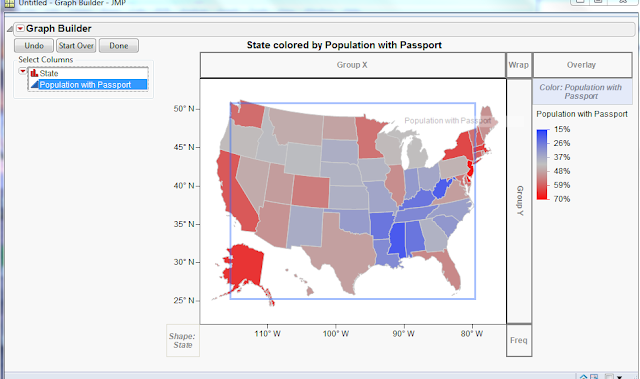
5. Right click on the color and select "Gradient..." to customize the colors as you like. I changed it to "White to Blue" and checked the "Reverse Colors" check box to match the original map.
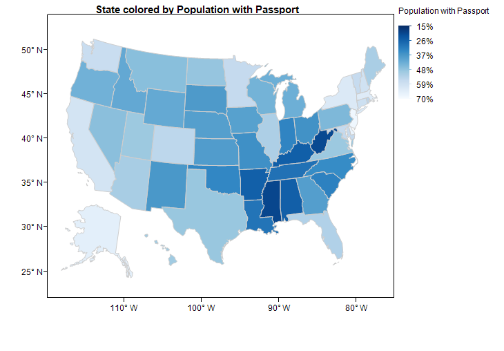
Below is the final result. Very quick and easy with a pretty result.
Luckily, the website has the source data so I "jumped" right in. It was really easy.
- Copy and paste the data into JMP.
- Open the Graph Builder under the Graph menu.
- Drag the State field into the shape area on the lower left corner.

4. Drag the Population with Passport field onto the main map. You can also drag it into the Color area.
5. Right click on the color and select "Gradient..." to customize the colors as you like. I changed it to "White to Blue" and checked the "Reverse Colors" check box to match the original map.
Below is the final result. Very quick and easy with a pretty result.
Comments
Nice work. You might try the reverse the labels instead of the colors -- I usually like the bigger numbers to be at the top of the legend list. (I also like bigger numbers to be associated with darker colors, but I realize you're trying to duplicate that feature of the original.)