Recently, Nate Silver wrote a post which analyzed how voters who voted for and against Barry Bonds for Baseball's Hall of Fame differed. Not surprisingly, those who voted for Bonds were more likely to vote for other suspected steroids users (like Roger Clemens). This got me thinking that this would make an interesting case study for factor analysis to see if there are latent factors that drive hall of fame voting.
The Twitter user @leokitty has kept track of all the known ballots of the voters in a spreadsheet. The spreadsheet is a matrix that has one row for each voter and one column for each player being voted upon. (Players need 75% of the vote to make it to the hall of fame.) I removed all players that had no votes and all voters that had given a partial ballot.
(This matrix either has a 1 or a 0 in each entry, corresponding to whether a voter voted for the player or not. Note that this kind of matrix is similar to the data that is analyzed in information retrieval. I will be decomposing the (centered) matrix using singular value decomposition to run the factor analysis. This is the same technique used for latent semantic indexing in information retrieval.)
Starting with the analysis, there is a drop off of the variance after the first 2 factors, which means it might make sense to look only at the first 2 (which is good because I was only planning on doing so).
votes = read.csv("HOF votes.csv", row.names = 1, header = TRUE)
pca = princomp(votes)
screeplot(pca, type = "l", main = "Scree Plot")

Looking at the loadings, it appears that the first principal component corresponds strongly to steroid users, which Bonds and Clemens having large negative values and other suspected steroid users being on the negative end. The players on the positive end have no steroid suspicions.
dotchart(sort(pca$loadings[, 1]), main = "First Principal Component")
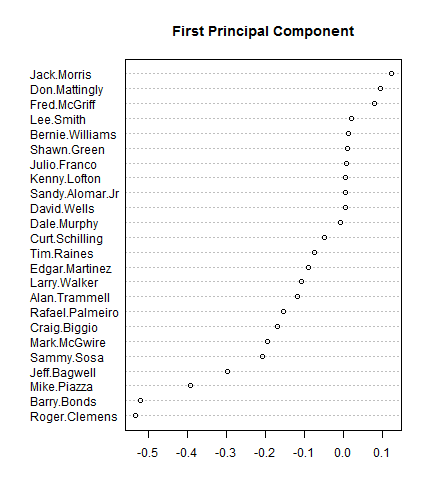
There also may be some secondary steroid association in the component as well separating players who have proof of steroid use versus those which have no proof but “look like” they took steroids. For example, there is no hard evidence that Bagwell or Piazza took steroids, but they were very muscular and hit a lot of home runs, so they are believed to have taken steroids. There is some sort of evidence the top five players of this component did take steroids.
dotchart(sort(pca$loadings[, 2]), main = "Second Principal Component")

Projecting the votes onto two dimensions, we can look at how the voters for Bonds and Clemens split up. You can see there is a strong horizontal split between the voters for and against Bonds/Clemens. There are also 3 voters that voted for Bonds, but not Clemens.
ggplot(data.frame(cbind(pca$scores[, 1:2], votes))) + geom_point(aes(Comp.1,
    Comp.2, colour = as.factor(Barry.Bonds), shape = as.factor(Roger.Clemens)),
    size = 4) + coord_equal() + labs(colour = "Bonds", shape = "Clemens")

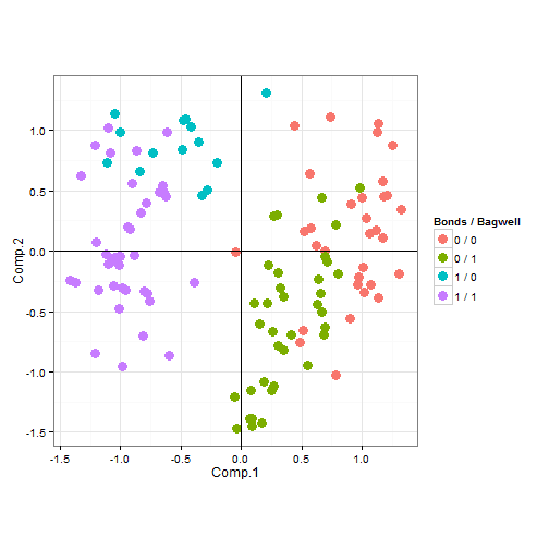
Similarly, I can look at how the voters split up on the issue of steroids by looking at both Bonds and Bagwell. The voters in the upper left do not care about steroid use, but believe that Bagwell wasn't good enough to make it to the hall of fame. The voters in the lower right do care about steroid use, but believe that Bagwell was innocent of any wrongdoing.
ggplot(data.frame(cbind(pca$scores[, 1:2], votes))) + geom_point(aes(Comp.1,
    Comp.2, colour = as.factor(paste(Roger.Clemens, "/", Jeff.Bagwell))), size = 4) +
    geom_hline(aes(0), size = 0.2) + geom_vline(aes(0), size = 0.2) + coord_equal() +
    labs(colour = "Bonds / Bagwell")
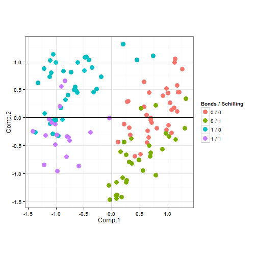
We can also look at a similar plot with Schilling instead of Bagwell. The separation here appears to be stronger.
ggplot(data.frame(cbind(pca$scores[, 1:2], votes))) + geom_point(aes(Comp.1,
    Comp.2, colour = as.factor(paste(Barry.Bonds, "/", Curt.Schilling))), size = 4) +
    geom_hline(aes(0), size = 0.2) + geom_vline(aes(0), size = 0.2) + coord_equal() +
    labs(colour = "Bonds / Schilling")
Finally, we can look at a biplot (using code from here).
PCbiplot <- function(PC = fit, x = "PC1", y = "PC2") {
    # PC being a prcomp object
    library(grid)
    data <- data.frame(obsnames = row.names(PC$x), PC$x)
    plot <- ggplot(data, aes_string(x = x, y = y)) + geom_text(alpha = 0.4,
        size = 3, aes(label = obsnames))
    plot <- plot + geom_hline(aes(0), size = 0.2) + geom_vline(aes(0), size = 0.2)
    datapc <- data.frame(varnames = rownames(PC$rotation), PC$rotation)
    mult <- min((max(data[, y]) - min(data[, y])/(max(datapc[, y]) - min(datapc[,
        y]))), (max(data[, x]) - min(data[, x])/(max(datapc[, x]) - min(datapc[,
        x]))))
    datapc <- transform(datapc, v1 = 0.7 * mult * (get(x)), v2 = 0.7 * mult *
        (get(y)))
    plot <- plot + coord_equal() + geom_text(data = datapc, aes(x = v1, y = v2,
        label = varnames), size = 5, vjust = 1, color = "red")
    plot <- plot + geom_segment(data = datapc, aes(x = 0, y = 0, xend = v1,
        yend = v2), arrow = arrow(length = unit(0.2, "cm")), alpha = 0.75, color = "red")
    plot
}

fit <- prcomp(votes, scale = F)
PCbiplot(fit)
