With the election nearly upon us, I wanted to share an easy way I just found to download polling data and graph a few with ggplot2. dlinzer at github created a function to download poll data from the Huffington Post's Pollster API.
The default is to download national tracking polls from the presidential election. After sourcing the function, I load the required packages, download the data, and make the plot.
Created by Pretty R at inside-R.org
 I have used transparency so that you can see when there are many polls on top of each other. You can see that Obama's lead decreased substantially after the first debate but has crawled back up since then. Of course, I am treating all polls as equal (although I am weighting by sample size) when the truth is that some polls are better than others and some are biased.
To have some more fun, I will show what some of the data from swing states look like. The code below loops through the swing states and downloads the polls. Then it plots the polls for each state in different facets.
Created by Pretty R at inside-R.org
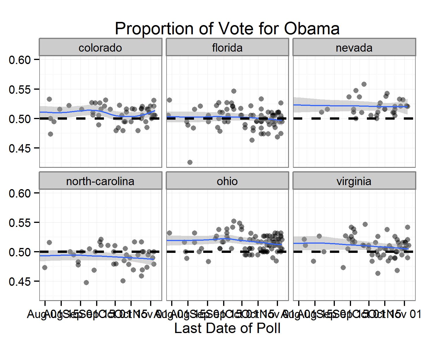 Unfortunately the x-axis didn't show up very well, but it starts at August 1. There have been quite a few polls in Ohio and Florida, haven't there? The state polls did not have nearly the same shift that the national poll did in reaction to the first debate. The state with the largest bump is Colorado, where the debate was held.
By just looking at the tracking polls, I think you would make the same conclusions that Nate Silver has with his fancy model. Ohio, Virginia, Nevada, and Colorado favor Obama. North Carolina favors Romney and Florida just barely tips toward Romney as well.
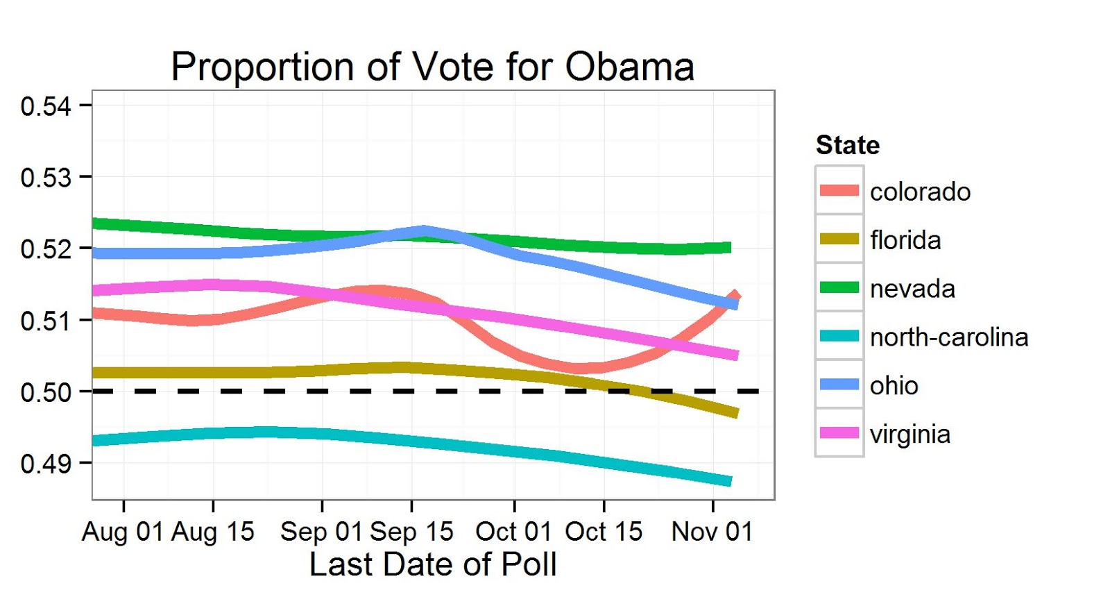
Finally, here are just the smoothed running means, all on one plot. You can see that There was also a first debate effect in Ohio.
The default is to download national tracking polls from the presidential election. After sourcing the function, I load the required packages, download the data, and make the plot.
library(XML)
library(reshape)
library(ggplot2); theme_set(theme_bw())

dat <- pollstR(pages=20)
ggplot(dat,aes(end.date,Obama/(Obama+Romney)))+geom_point(alpha=.5)+geom_smooth(aes(weight=sqrt(N)))+geom_hline(aes(yintercept=0.5),lty=2,size=1)+
  labs(title="Proportion of Vote for Obama",x="Last Date of Poll",y=NULL)
To have some more fun, I will show what some of the data from swing states look like. The code below loops through the swing states and downloads the polls. Then it plots the polls for each state in different facets.
swing.states=c("ohio","florida","virginia","colorado","nevada","north-carolina")
for (s in swing.states) {
  print(s)
  dat.state <- pollstR(chart=paste("2012-",s,"-president-romney-vs-obama",sep=""),pages="all")
  dat.state=subset(dat.state,select=c("id","pollster","start.date","end.date","method","N","Obama","Romney"))
  dat.state$State=s

  if (s=="ohio") {
    dat=dat.state
  } else {
    dat=rbind(dat,dat.state)
  }
}

library(lubridate)
dat$end.date=ymd(as.character(dat$end.date))
ggplot(dat,aes(end.date,Obama/(Obama+Romney)))+geom_point(alpha=.5)+geom_smooth(aes(weight=sqrt(N)))+geom_hline(aes(yintercept=0.5),lty=2,size=1)+
  labs(title="Proportion of Vote for Obama",x="Last Date of Poll",y=NULL)+facet_wrap(~State)+xlim(c(mdy("8/1/2012"),mdy("11/6/2012")))
By just looking at the tracking polls, I think you would make the same conclusions that Nate Silver has with his fancy model. Ohio, Virginia, Nevada, and Colorado favor Obama. North Carolina favors Romney and Florida just barely tips toward Romney as well.
Finally, here are just the smoothed running means, all on one plot. You can see that There was also a first debate effect in Ohio.
Created by Pretty R at inside-R.org
http://wp.me/p17axt-jK
ggplot(dat,aes(end.date,Obama/(Obama+Romney)))+
geom_point(aes(size=sqrt(N)),alpha=.5)+
geom_smooth(aes(weight=sqrt(N)))+
geom_hline(aes(yintercept=0.5),lty=2,size=1)+
labs(title="Proportion of Vote for Obama",x="Last Date of Poll",y=NULL)+
facet_wrap(~method)+
theme(axis.text.x=element_text(angle=-90))
+theme(axis.text.x=element_text(angle=-90))