Correlation matrices are a common way to look at the dependence of a set of variables. When the variables have spatial relationships, the correlation matrix loses some information.
Lets say you have repeated observations, each one being a matrix. For example, you could have yearly observations of health statistics for a spatial grid. Lets say the grid is n by p (n*p variables) and there are m observations of the grid. If we want to get the correlations of each element of the grid, the typical way to do that would be to convert the matrix of variables into a vector of length n*p, and then calculate the correlation matrix of the vector. When you do that, however, it will no longer be obvious which of the variables are on the same row/column or are close to each other. So the typical correlation matrix is not satisfactory.
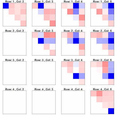
What I propose is a set of small multiples of correlation matrices. Instead of having an n*p by n*p correlation matrix, we will have an n by p grid of correlation matrices, each correlation matrix representing the correlation with the variable in that position of the matrix. Below is an example.
 The above example is just random data, so all correlations are spurious. Blue is positive, red is negative, and white is no correlation. You can see in the row 1, column 1 matrix that the 1st row and 1st column is dark blue. This is because this is the correlation with itself. Similarly in all other rows and columns.
Using a real example might display the usefulness more clearly. I am on a project estimating elements of a matrix with only the row totals and column totals. I simulated data many times and kept track of the errors. I was interested in how the errors in the different cells are correlated with each other. Below, you can see that the errors in the same row or column are positively correlated with each other, while the errors in other rows and columns are negatively correlated. This pops out at you with the below plot, but would have been difficult to figure out with a typical correlation matrix.
Code:
# Generate random data for the example
reps=10
mat.data=array(0,c(4,5,reps))
for (i in 1:reps) {
mat.data[,,i]=matrix(rmultinom(1,20,rep(1,4*5)/(4*5)),4,5)
}
matrix.cor.plot(mat.data)
# the function
matrix.cor.plot <- function(mat.data) {
#mat.data should be a nrow by ncol by nrep array
nrow=dim(mat.data)[1]
ncol=dim(mat.data)[2]
# nrep=dim(mat.data)[3]
par(mfrow=c(nrow,ncol),cex=.75,bty="o",mar=c(1, 1, 1, 1) + 0.1)
# red is -1, white is 0, blue is +1
rgb.palette <- colorRampPalette(c("red","white","blue"), space = "rgb")
for (r in 1:nrow) {
for (c in 1:ncol) {
cor.mat=matrix(0,nrow,ncol)
for (r2 in 1:nrow) { for (c2 in 1:ncol) {cor.mat[r2,c2]=cor(mat.data[r,c,],mat.data[r2,c2,]) } }
cor.mat=t(cor.mat)
cor.mat=cor.mat[,ncol(cor.mat):1]
image(cor.mat,zlim=c(-1,1),col=rgb.palette(120),axes = FALSE,main=paste("Row:",r,"Col:",c))
box()
}
}
}
Lets say you have repeated observations, each one being a matrix. For example, you could have yearly observations of health statistics for a spatial grid. Lets say the grid is n by p (n*p variables) and there are m observations of the grid. If we want to get the correlations of each element of the grid, the typical way to do that would be to convert the matrix of variables into a vector of length n*p, and then calculate the correlation matrix of the vector. When you do that, however, it will no longer be obvious which of the variables are on the same row/column or are close to each other. So the typical correlation matrix is not satisfactory.
What I propose is a set of small multiples of correlation matrices. Instead of having an n*p by n*p correlation matrix, we will have an n by p grid of correlation matrices, each correlation matrix representing the correlation with the variable in that position of the matrix. Below is an example.
Using a real example might display the usefulness more clearly. I am on a project estimating elements of a matrix with only the row totals and column totals. I simulated data many times and kept track of the errors. I was interested in how the errors in the different cells are correlated with each other. Below, you can see that the errors in the same row or column are positively correlated with each other, while the errors in other rows and columns are negatively correlated. This pops out at you with the below plot, but would have been difficult to figure out with a typical correlation matrix.

Code:
# Generate random data for the example
reps=10
mat.data=array(0,c(4,5,reps))
for (i in 1:reps) {
mat.data[,,i]=matrix(rmultinom(1,20,rep(1,4*5)/(4*5)),4,5)
}
matrix.cor.plot(mat.data)
# the function
matrix.cor.plot <- function(mat.data) {
#mat.data should be a nrow by ncol by nrep array
nrow=dim(mat.data)[1]
ncol=dim(mat.data)[2]
# nrep=dim(mat.data)[3]
par(mfrow=c(nrow,ncol),cex=.75,bty="o",mar=c(1, 1, 1, 1) + 0.1)
# red is -1, white is 0, blue is +1
rgb.palette <- colorRampPalette(c("red","white","blue"), space = "rgb")
for (r in 1:nrow) {
for (c in 1:ncol) {
cor.mat=matrix(0,nrow,ncol)
for (r2 in 1:nrow) { for (c2 in 1:ncol) {cor.mat[r2,c2]=cor(mat.data[r,c,],mat.data[r2,c2,]) } }
cor.mat=t(cor.mat)
cor.mat=cor.mat[,ncol(cor.mat):1]
image(cor.mat,zlim=c(-1,1),col=rgb.palette(120),axes = FALSE,main=paste("Row:",r,"Col:",c))
box()
}
}
}